Expo Astana 2017 reveals its new logo
日期:07-26-2013来源:BIE WebsiteExpo Astana 2017 revealed today its new logo after a public vote and a decision by the State commission on Preparation for the International Specialized Exhibition EXPO 2017:

For the Expo organisers, this logo fully embraces the theme of the Expo "Future Energy". The colours of the logo stand for three renewable energy sources: water, nature and sunlight, and its design recalls a fourth one : wind.
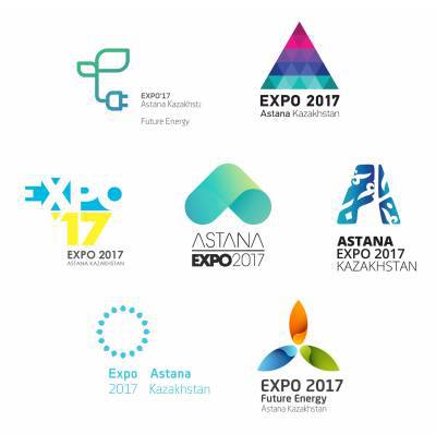
The logo was chosen among 6 other proposals, all very influenced by the theme of the Expo « Future Energy » and by the city of Astana. We can identify for example the Palace of Peace and Reconciliation in the « Pyramid » logo (second one from the left).

The Expo organizers had established a set of three essential rules each logo had to assimilate:
- Be ahead of its time
- Express visually and symbolically the theme of the Expo
- Have an international reach
These seven logos were submitted to the Kazakh public on social networks and on the website of the Expo between the 9th and the 22nd of July, a participatory initiative that managed to unite at least 10 000 people around Expo Astana 2017. Two logos clearly stood out from the rest: the « Green Energy » logo that represents a plug coming from a sprout and the « Wind energy logo » that was chosen. Following the tight scores obtained by these two proposals on the different digital platforms, the State Commission made the final call today.
This change in visual identity marks for Kazakhstan the transition from the candidacy phase to the official organization of the Expo. It is therefore a step that bears symbolical importance in the development of the project and a major event for the communication of the Expo since it has set the emblem of Expo Astana 2017.